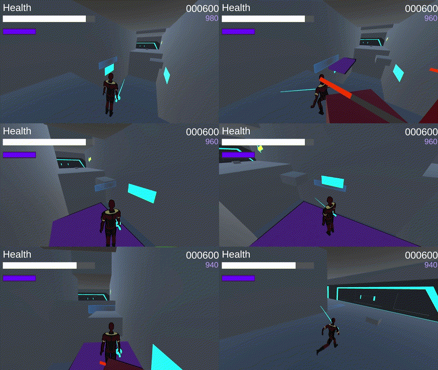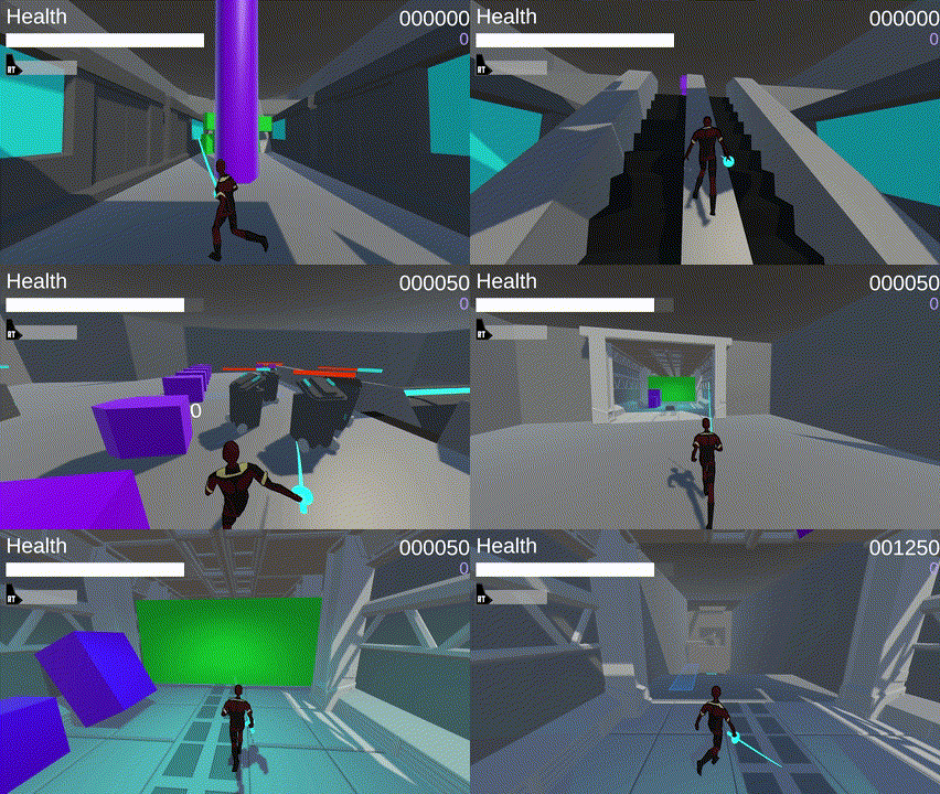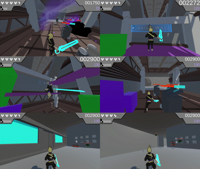
Description: Jump into an underground metro system to defend the city from rogue janitorial equipment! High Maintenance is a fast-paced mashup of classic arcade games with modern action gameplay.
Platform: PC Genre: Arcade, Hack-and-Slash
Role: Lead Level Designer, Game Designer
Date: January 2023 - May 2023

Won Best UI/UX at the 2023 Ubisoft Montreal Game Lab Competition

Team Members
Andrea Kutsup - Prop, Environment Artist
Joseph Romanowski - Technical Designer, Scrum Master
Nathan Desjardins - General Programming
Nicolletta Rothschild - Game Design, UI, Product Owner
Noah Cichowlas - Music, SFX
Noble Westbrook - Character Art, Animations, VFX
Samuel Fox - AI Programming
Sam Sussman - Level Design, Encounter Design

Design Process
High Maintenance was made for the 2023 Ubisoft Montreal Game Lab Competition meaning we had to stick to very specific guidelines on what our games focuses had to be. The theming of the competition was "Arcade" with the requirements of an online leaderboard, creation and destruction mechanics, and gravity modulation. With these in place we began prototyping and came up with the concept of mixing modern action gameplay with arcade mechanics of the past. So my task was to figure out how to mix the two styles into levels that worked with the required elements of the competition.
I started by prototyping a very simple linear blockout that uses the prototyped mechanics in different ways. I created some physics objects that the player could move around using the gravity sword in order to complete some basic platforming. The platforming felt good and fit in the style of arcade but using the physics objects as platforms became more of a problem than we hoped so I changed it to be obstacles instead. In this blockout I also tested out how our wall creation mechanic could work as a platforming tool as well which worked incredibly well.


Once we started figuring out gameplay systems it was time to start the actual level blockouts. Since we needed an online leaderboard we decided to take an approach similar to classic arcade games such as Donkey Kong that keeps the player looping through different levels and accumulating a score as they go. With that I concepted 3 different levels for the player to loop through. I got to work quickly blocking them out in order to get the game in a testable state as soon as possible. We decided as well that the setting of the game would take place in a metro station, so I found and took some reference images of the Montreal metro to use when creating the blockouts. I decided that having a motif for the start and end of levels being the train stops would be a goodd place to start.
From my references how different yet similar each stop was architecturally. Similar design patterns but different in scale was the guidelines I set when designing the spaces. I wanted each level to have a different feel using the sizes of the spaces while still leaving enough room for the combat arenas to feel spacious since we are throwing enemies into walls. Level one I kept simpler with consistent medium sized rooms so the player had a basic idea of the gameplay. Level 2 I went and made the rooms larger with some more interesting set pieces. I originally wanted to get a large train that moved with gravity to crush enemies in the track room but due to time constraints had to remove it. Level 3 I made expand the further you go, so rooms start tighter but eventually expand into wide and tall arenas. The last room is the most unique of all the rooms as rather than a set number of enemies spawning in front of the player I had them fly out of vents for a set amount of time.
The blockouts were finished and we went into the polish phase where we started art implementation and refining enemy encounters. We knew that if the encounters stayed the same throughout the game would never ramp up in difficulty like arcade games tend to do, so we created a system that every time a level is complete the enemy AI gets more aggressive and more enemies start to spawn within the rooms. Due to this change as well we needed to find a way to show the player how many enemies remained within the room since it could get overwhelming. We created these message boards that reads how many enemies were in the space and counts down as the player defeats them. I also started filling the spaces with destructible pieces so the player could keep adding to their building resources.
We also covered the levels in graffiti guidelines such as painted arrows to make sure players were always kept going forward. We also included some cosmetic graffiti with references to some other teams games and jokes to make the setting feel more like a metro. In the final version of High Maintenance the level design was praised and the arrows and boards were said to be key parts of why we ended up winning the award for best UI/UX.

Postmortem

Looking back on High Maintenance I think the project was a huge success not only from the competition but from a personal standpoint. It really helped me make the decision to lean into level design as it was a piece that I was incredibly proud of and was overwhelmingly viewed positively. I feel I really grew into my own as a designer from the project, but there are some things that I would have done differently now. First of all since we were in such a tight timeframe documentation was put to the side in favor of implementation and I feel that we could have benefited more from having proper level documents. I also think I would have tried to make the arenas more unique than they ended up being as most spaces do look and feel.
I am incredibly proud of this project and had an incredible time working with the team.
